Having finished the my initial batch of five short stories and published them electronically, I thought they constituted a large enough body of work to warrant a physical edition. Not because I expected a rush of sales from those waiting for a paper copy, but mainly because it’d be nice to give something out to friends and family (okay, so I was hoping for a few sales too).
There are plenty of options for print-on-demand (POD) publishing these days, from Lulu, to Blurb, to the Amazon owned CreateSpace. I’m UK-based, so there’s also the likes of Lightning Source and FeedARead to consider.
I did a bit of research and finally felt ready to make a decision on who to use. I opted for CreateSpace. Why them? Well, it largely came down to money. I wanted to produce the paperback, and have it listed in Amazon’s web store in the UK and US. I wasn’t fussed about allowing bookshops to order it (something I felt highly unlikely to happen). (CreateSpace can distribute to some of the trade warehouses, for free now, but the book has to be a certain size, so be aware of that.)
Setup Costs
While most of the other services charged for either setup, distribution to Amazon, revisions or an annual listing fee, CreateSpace was free. It didn’t seem to take that back by offering a lower royalty rate either. Frankly, I thought it was unlikely I would make much (if anything) from sales, so the setup or listing fees were only going to come out of my pocket.
Getting Started
Having made my decision, I read a few articles where people shared their experience of publishing through CreateSpace. Then I created my account and clicked Add New Title.
ISBN
One of the benefits of CreateSpace is they give you an ISBN for free. Buying one isn’t exactly expensive, and gives you a lot more freedom, as you can take your book to other POD companies, but free sounded good to me.
Picking a Size
The first decision you’ll have to make is the size of your book (you get a choice of colour or B&W too, but 99.9% of fiction books are B&W). The size is more than just an aesthetic decision, because it affects the number of pages your book will come to, which is how the cost is calculated (and therefore what you need to charge to make a profit).
A 250 page 6”x9” book is cheaper than a 300 page 5”x8” one, for example. There’s a royalty calculator that shows you what the costs and your earnings will be, based on what you select and what end price you wish to sell at.
I didn’t have a clue what size a book was. In the end, I dug out a ruler and measured those I had nearest to me. The majority of paperbacks I looked at were 5.06”x7.81”, this seems to be fairly standard for the UK. During my research, the more regular 5”x8” also came out as a popular choice, as did the trade paperback sized 6”x9” (rarer in the UK I think, it’s like a hardback, but with a paperback jacket).
Size, combined with the page colour you pick (white or cream, see below), also has an impact on the extended distribution channels (if that’s of interest). I was warned my 5.06”x7.81” in cream would not be eligible, for example, while it was fine with white pages.
Paper Colour
This hadn’t even dawned on me until I was confronted with it. There’s two options: cream and white. Apparently, cream is more common in fiction (certainly true in my collection of books), while white is used for non-fiction, especially where colour reproduction is important. Having said that, I had at least one fiction book in reach that was printed on white, and it wasn’t as dazzling as some people suggested (I quite like the extra contrast). I decided to follow the herd and opted for cream though.
Internal Layout
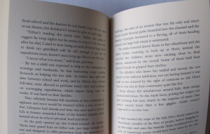
Having picked your options, you should be able to download a Word template to get you started. I also grabbed a copy of their example. I found Anne Charnock’s post useful for picking some of the options, and started making changes to the Normal style (11pt Garamond, 14.5pt line height), and Header 2 (14pt Garamond, All Caps).
Having seen the end result, I wouldn’t go below 11pt. 12 might have been nicer, but it’s another thing that will increase the length of the book, so will impact what you can sell for.
I left the margins alone, but you can tweak them if you wish (to help reduce the page count). Part of the reason I didn’t touch them was I wasn’t sure when the cut-off points were, but there’s plenty of room at the top and bottom, plus some wiggle room on the outside edge.
Having pasted my various stories into the document, I started looking at the flow in more detail. Making the story titles uppercase, and moving them down so they had a nice area of whitespace above them. I have a new found appreciation for typesetters.
Widows and orphans is another term you’ll come across. This is where you have a single line at the end of a page, or a short end of a sentence at the top of one. Some people don’t see to mind them, but most traditionally published books don’t have them.
Word doesn’t offer a lot of control of type (other programs do), so the only tools I had to alleviate them were the Scale and Spacing options on the Character Spacing tab of the Font Formatting box.
I found that you could go up to 110% without it looking too funky, but not below 95%. For spacing, much more than 0.5pt on the Condensed setting looked too weird. I found it was better to expand than condense if you can. If I couldn’t fix it in that range the only real option was to push the sentence to the next page.
I added page numbers in the footer, aligned to the outside edge, using a section break to get it to start at the right place and alternating the alignment for odd and even pages so the number appeared in the correct place.
The table of contents took a while to style correctly, but I got there in the end.
The Cover
Once you’ve finished your internal layout and know the number of pages you have, you can log in to CreateSpace and generate both a PDF and a PNG template of the cover (because the spine size is determined by the number of pages, obviously).
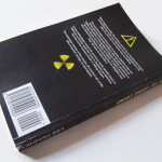
You can use their cover creator, but I chose to make my own. I was disappointed to find the cover image I used for the e-book version wasn’t large enough, so had to go find another one. There was a benefit: I got to have it dark all around. I knew my previous image wouldn’t wrap around, so I’d have had a black spine and back anyway.
I used GIMP to create my cover, and I found this video by Elisabeth Niederhut, and this video by Stacie Vander Pol quite useful in helping guide me, especially when it came to bleed areas and trim lines.
I didn’t really have a clue what to put on the back, other than my blurb. It looked so bare I found a couple of GIMP brushes that looked vaguely related and added those.
You need to leave space for the barcode, but you don’t need to create a block of white for it if you have a coloured background, CreateSpace seem to do that for you.
Description
When you add your book description, bear in mind that you can use some (limited) HTML to allow some formatting of paragraphs and text. Despite having spaces between my paragraphs in the box on CreateSpace, this didn’t come through to Amazon, so worth using the relevant HTML tags here. You can always edit through Author Central though.
Proofs
Once you’ve completed everything, you get the choice to proof online, or order a copy (at a discounted rate). For those of us in the UK, the price of shipping a physical proof is high, and the delivery times range from long (8 days) to ridiculous (six weeks). Or at least they did for me.
An alternative method is to proof online and make your book available on Amazon, but set the UK price as low as it will go. When it appears in the UK store (it quoted 5-7 days, but mine appeared the same day, even though it was a Saturday), you can then order with the usual delivery (faster and cheaper). These copies aren’t printed by CreateSpace but by a partner in the UK, so they may not look identical to the US ones.
It is worth taking a bit of a look through the online proofs, rather than just assuming it’s all good. I found my page numbers were on the wrong sides (I wanted them on the outside edge, but managed to get them in the middle), plus some of the stuff I put at the end of the book didn’t make any sense in an anthology.
Ordering Copies
Assuming you’re happy with your proofs, you can either order additional copies via Amazon UK (i.e. your local store), then put the price up. Or you can reinstate the correct price, and order copies through CreateSpace. These can work out at a lower price overall, if you order enough and/or have the patience to pick one of the slower delivery options. For me, ordering 10 worked out cheaper even with priority shipping, but more expensive if I was only ordering five.
It’s also worth noting that, as they’re not sales through the Amazon store, you won’t get any ranking boost going that route.
While it may be cheaper to order in bulk, it only saves you money if you don’t have to then post the copies out, otherwise it’s cheaper to get Amazon to send them for you (at least, it was for me).
Summary
There you have it, you should be holding a copy of your work, which was a very exciting feeling. It also means you can reach those people who haven’t yet gone the digital route. It’s a fairly long process, but it’s the sort of thing that’ll get faster with practice, and easier the more you do it. There’s plenty of advice out there to help you too. Of course, you can always hire someone to do all this for you.


